It’s Bobbi Lemanski here and I have a confession. I made this sympathy card a while ago and I was not happy with it so I never shared it. I picked it up again this past week, analyzed it and realized it just fell “flat” for me. Does this ever happen to you? I’ve been making cards long enough to know that it generally is better to walk away from a project, look at it another day, and then decide what to do. A fresh perspective always helps to salvage a card you aren’t crazy about! I’m sharing the changes I made to it to get it to a level I was willing to share.
My sympathy card features the following Honey Bee Stamps products from the Vintage Love release:
Lovely Layers: Sweetheart Roses Honey Cuts dies
Floral Heart 3D Embossing Folder and Coordinating Die Set
Lovely Layouts: Posted – Honey Cuts dies
Blooming View stamp set and coordinating Honey Cuts dies (for the “deepest sympathy sentiment, only)
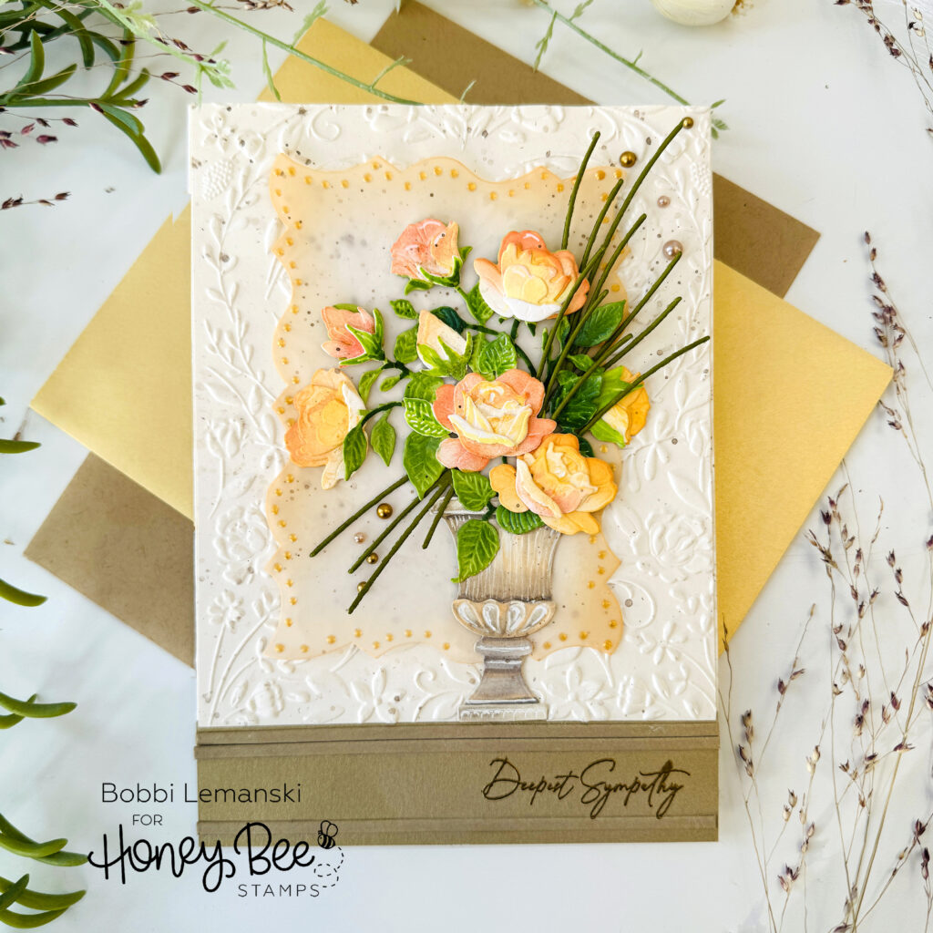
The featured project below is made from Neenah 80lb Solar White cardstock for the card base and a natural fleck ivory and antique gold metallic cardstock for the front panel. I used Honey Bee Stamps Bee Creative Precision Glue for adhering my elements together. My card is 5″ X 7″ in size. I use the Bee Creative Clear Embossing and Watermark Ink Pad for all heat embossing.
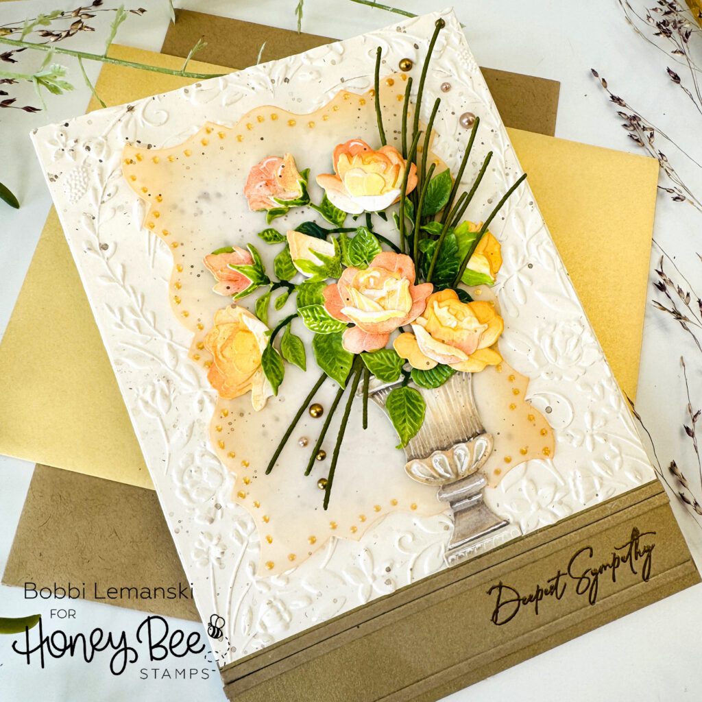
After reviewing my card, I decided my card just needed more depth. I changed out the background to a background embossed with the Floral Heart 3D Embossing Folder and Coordinating die set. I splattered the background with metallic gold and brown watercolor ink. I set it aside to dry. This was a huge improvement already. The embossing folders always add so much more interest to a card.
Next, I added more color and shading to the footed planter using Copic Markers including W3, W4, W3, W1, E40, E43, E51, E53. This helped highlight the detailing on the cement planter. I also die cut more roses and added them to the floral bouquet to add more color to the arrangement and less vacant spots. I started with four roses and ended with a total of eight roses. I used Distress Oxide Ink in Saltwater Taffy and Mustard Seed to ink blend the color on the petals. I also added additional foliage to the design, too. Green sprigs tucked inside the bouquet in a diagonal line gave more life, realism and interest to the bouquet.
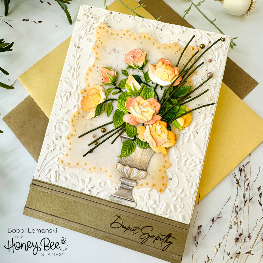
I also added some shading to the vellum frame using Distress Oxide Ink to accentuate the frame edge detail. It’s so pretty and just needed to be highlighted a bit more with color. I added Glass Effects Gel dots in gold for extra dimension around the perimeter. I layered the floral bouquet, frame and the embossed background, then added the gold metallic strips at the bottom. The “deepest sympathy” sentiment was heat-embossed in gold on the metallic cardstock. All of these details added more depth, dimension and interest. I like the final look so much better than where I started!
You can shop the entire Honey Bee Stamps Vintage Love Release here. If you decide to place an order, please use the links in this post so that Honey Bee knows which ideas inspired you!
Thanks for stopping by today. If you want to see more ideas and inspiration from me, subscribe to my blog, BobbiHartDesign.com. I’ll send you updates on new posts! You can also find me on Instagram as @BobbiHartDesign and on Facebook as BobbiHartDesign.